If you are like me, those repeat holidays can get somewhat challenging to scrapbook! Every year, same ideas, same color scheme, etc...Join me today as I walk you thru 10 Halloween Scrapbook Layout Ideas and Tips to help keep things fresh. First up I have a video walk-thru and then check them out up close below that.
10 Halloween Scrapbook Layout Ideas & Tips Video
Up Close Halloween Layout Ideas
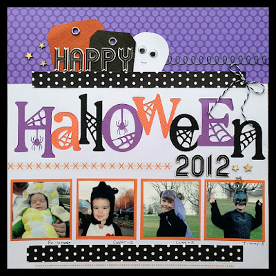
Tip Number 1: If you don't have Halloween Supplies pull out some neutral pieces in the right colors from your stash. This entire layout has nothing "Halloween themed" on it aside from the cut file I used for the title. The rest is pulled from Purples, Oranges, and Blacks in my Stash.
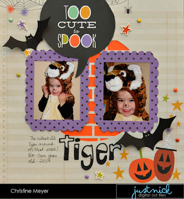
Tip Number 2: Personalize a collection with cut files, punches, stamps or metal dies. You can keep a layout from looking like everybody else's by personalizing it with your tools. You can find tons of fun metal dies here and stamps here.

Tip Number 3: If you are low on your supplies - use a clear Halloween base for your layout and then build it up with neutral pieces. My base page is here is clearly for Halloween - the rest makes it even better!
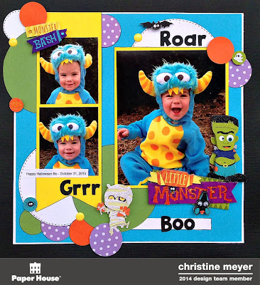
Tip Number 4: Base the whole layout on the colors in the costume not Halloween Colors. For this layout I went with that turquoise color that you can see in his monster costume and just added Halloween embellishments that played up the theme.
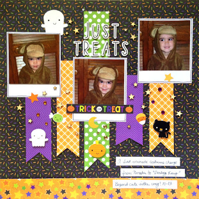
Tip Number 5: Multiphoto layouts are so common for Halloween - add small embellishments on multi-photo layouts so that the photos are the star.
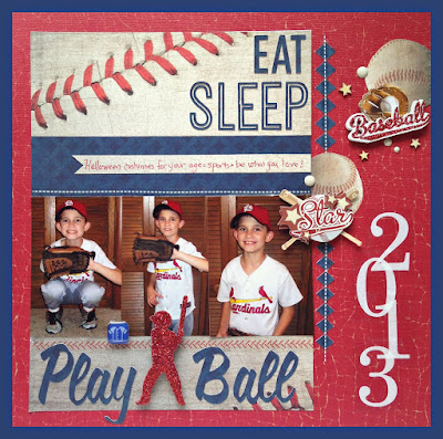
Tip Number 6: Bail on Halloween completely and do the whole layout based on their costume. Oftentimes the costume has nothing to do with Halloween and is just a fun theme to work with.

Tip Number 7: Play with Words for your Title - think catchy phrases that don't have anything to do with Halloween. Part of why I love this layout is because the title is something we say all the time "Something Stinks."
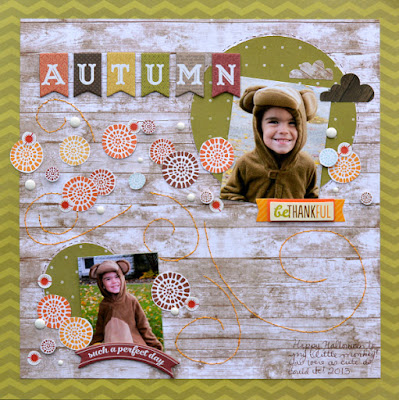
Tip Number 8: Much like the last tip but on this one I say bail on Halloween and focus on Autumn. This works especially well for playing down the spookiness of Halloween.
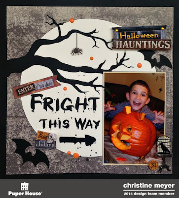
Tip Number 9: Focus on the shapes of Halloween like I did here mimicking the moon. Think pumpkins, crescents, triangles for candy corn...the options are endless!
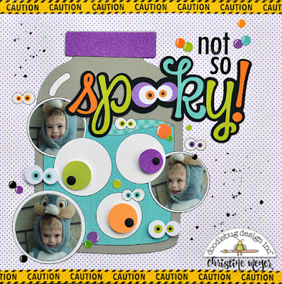
Tip Number 10: Shape your pictures! As you can see here I went with the ideas of eyeballs and shaped my pictures to match that.
Wanna check out some more Halloween Products?
Here's Affiliate Links to some of my Favorites from companies that I use! Click on any of them to see a whole bunch of products and as always - thanks for your Support!
Doodlebug Halloween Collections: http://shrsl.com/ksup
Simple Stories Halloween: http://shrsl.com/ksus
Echo Park Halloween: http://shrsl.com/ksuv
Tim Holtz Halloween: http://shrsl.com/ksux
Paper House Productions Halloween: http://shrsl.com/ksuz
Carta Bella Halloween: http://shrsl.com/ksv0
Photo Play Paper Halloween: http://shrsl.com/ksv2
Halloween Dies: http://shrsl.com/ksv4
Halloween Stamps: http://shrsl.com/ksv7

2 comments:
Wonderful layouts! My fave is the googly eyes and jar!
Some great layouts. Could you tell me where you got your cobweb Halloween cut file?
Post a Comment