One thing that may jump out to you immediately, and makes this collection different, is the different scale on the Plaids. They aren't all the same, so although they coordinate, you aren't getting all the exact same pattern with just different colors. This led me to design a little differently as I created this. I initially thought I'd put everything on straight and have a "quilted" look. BUT as I was just haphazardly placing the triangles on, I noticed that the different scales lended itself nicely to a little bit of a messier (for lack of a better word) look. So I took a chance and am so happy I did!
I also used a cut file to create a big title focal point!
Backing the cut file with black really made it pop and allowed me to bring in more black throughout the layout - even going with a black cardstock base.
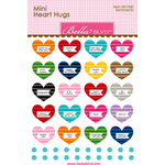
You can also see I brought in lots of enamel dots that coordinated from the Heart Hugs sets and just placed a few in each color area.
Finally I brought in lots of black hearts from various Heart Hugs sets. As I was debating how to embellish and pulled these out, I just knew a row of the black ones would be a great contrast and help to bring in one final touch of black.
Want to see how this whole thing came together? You can check it out in the video below:
Thanks so much for joining me today! You can check out any of the products in the affiliate thumbnails below!


1 comment:
Looking awesome this one post . I appreciated guy for this well shared . Image Resizing Tips
Photo Cropping
Clipping Path
Cut Out Background
Photography Help
Photo Touch Up
Product Photo Editing
Clipping Path
Photography Help
Photo Editing
Post a Comment