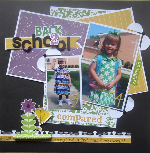
 I uploaded this photo to Flickr because blogger is giving me fits! I'm really loving a solid black or solid white background for my layouts lately, but that being said I think they are both hard to photograph! Hope y'all are having a great relaxing weekend!
Saturday, April 28, 2012
Back to School Compared
I created this layout comparing Lucy's PK3 and PK4 pictures from the first day of school. I can't believe how much older she looks in the second one!
 I uploaded this photo to Flickr because blogger is giving me fits! I'm really loving a solid black or solid white background for my layouts lately, but that being said I think they are both hard to photograph! Hope y'all are having a great relaxing weekend!
 I uploaded this photo to Flickr because blogger is giving me fits! I'm really loving a solid black or solid white background for my layouts lately, but that being said I think they are both hard to photograph! Hope y'all are having a great relaxing weekend!
Subscribe to:
Post Comments (Atom)

3 comments:
I love the black background! And the layering behind the photos is great, too.
Okay...that was me leaving the anonymous comment. I don't know what happened? Sorry!!
What an awesome layout, i love it. And wow what a difference a year can make huh!! crazy
Post a Comment